The BioTIMEr package provides tools designed to interact
with the BioTIME database, which contains assemblage time series from
multiple habitats and for multiple taxa (Dornelas et al 2018, 2024). The
functions provided include the BioTIME recommended methods for preparing
time series data (gridding and rarefaction), calculating a selection of
standard biodiversity metrics (e.g. species richness, numerical
abundance and exponential Shannon index) per year, alongside examples on
how to calculate and plot linear trends of biodiversity change over
time.
Note that each study in BioTIME is identified by a unique Study_ID and that all the functions in BioTIMEr assume that the variables are named as in the BioTIME data.
Load the required libraries
When loading the BioTIMEr package, a subset of BioTIME data is loaded together with its metadata. This subset includes 12 studies from marine, terrestrial and freshwater time series across different taxonomic groups. The whole BioTIME database is accessible here
# you can run the following commands to retrieve more information about the subsets.
?BTsubset_meta
?BTsubset_data
# you can also see a full list of BioTIMEr functions and help pages by:
??BioTIMEr
How to use BioTIMEr?
- Grid BioTIME data into a discrete global grid based on the samples’ location (latitude/longitude) to standardize the spatial extent between different studies using:
- Apply sample-based rarefaction to standardize the number of samples per year within each cell-level time series using:
- Calculate a set of standard alpha and/or beta diversity metrics using:
- Fit linear regression models to step 3 outputs as a function of time with:
- Visualise the results.
Below is a detailed run through these different steps, breaking down some of the tasks and the reasoning behind our suggestions for best practice when analysing BioTIME data.
We use the ‘pipe’ operator (|>) to make our code more
efficient and streamlined, and we use ggplot2 library for most
visualisations. This and other libraries required for BioTIMEr to run
will be, if needed, installed at the same time BioTIMEr is
installed.
Why bother with separating observations using a global grid?
Typically, a BioTIME study contains distinct samples collected with a
consistent methodology for a given period of time. However, the spatial
extent and sample distribution among studies can vary substantially
depending on the study and the taxon being sampled (e.g. forest
quadrants, bird transects, fish tows, etc.; which can be implemented
within smaller or larger areas). Because the spatial extent varies among
studies, an advisable step is to grid those studies that have large
extents and multiple sampling locations into smaller equal-sized
subsets. The gridding() function is designed to perform
such task using a global grid of hexagonal cells derived from dggridR
(see vignette(‘dggridR’)). By implementing this gridding,
the large scales studies are split into multiple cell-level assemblages,
while the small scale studies are assigned to a single cell.
Let’s apply gridding() to a subset of BioTIME data and
see what happens:
grid_samples <- gridding(meta = BTsubset_meta, btf = BTsubset_data, res = 12, resByData = FALSE)

# Get a look at the output
# grid_samples |> head() |> kable()
You can see that each sample is assigned a different combination of
study ID and grid cell (based on its latitude and longitude) resulting
in a unique identifier that determines our assemblage time series
(assemblageID). This assemblageID can now be
used as the study unit for analysis of biodiversity change based on
similar spatial extent between them.
Let’s take a look and see how many studies/cells/assemblages time series are there in this subset:
check_res_1 <- grid_samples |>
  group_by(STUDY_ID, StudyMethod) |>
  summarise(n_cell = n_distinct(cell), n_aID = n_distinct(assemblageID), res = "res12")

check_res_1 |> head(10) |> kable()| STUDY_ID | StudyMethod | n_cell | n_aID | res |
|---|---|---|---|---|
| 10 | SL | 1 | 1 | res12 |
| 18 | SL | 1 | 1 | res12 |
| 41 | SL | 1 | 1 | res12 |
| 53 | SL | 1 | 1 | res12 |
| 59 | SL | 1 | 1 | res12 |
| 211 | ML | 12 | 12 | res12 |
| 333 | SL | 1 | 1 | res12 |
| 372 | ML | 85 | 85 | res12 |
| 402 | ML | 3 | 3 | res12 |
| 431 | ML | 456 | 456 | res12 |
# How many samples were there in each study?
ggplot(data = check_res_1) +
geom_bar(mapping = aes(x = as.character(STUDY_ID), y = n_aID, fill = res),
stat = "identity") +
scale_fill_discrete(type = c("#155f49")) +
xlab("StudyID") + ylab("Number of assemblages in a study") +
theme_bw() +
theme(legend.position = "none")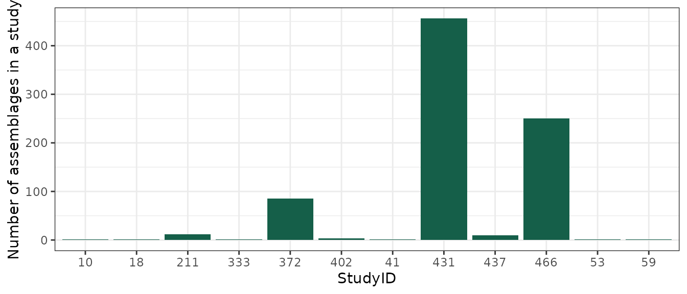 You can see that several studies are not partitioned, and that’s because
all their observations were already contained within a single cell.
What happens if I change res?
By default, the function separates studies into hexagonal cells of
~96 km2 (res=12), as this resolution was found to be the
most appropriate when working on the whole BioTIME database. Yet
sometimes, particularly when working with a subset of BioTIME, you may
want to explore alternative grid resolutions. The function has two
options: you can either directly define a new resolution (see
vignette(‘dggridR’)) or allow the function to find the best
resolution based on the average study extent of your dataset. Let’s run
over these alternative options with a few examples:
# define an alternative resolution of 14 (~10.7 km2 cells)
grid_samples_14 <- gridding(meta = BTsubset_meta, btf = BTsubset_data, res = 14, resByData = FALSE)

# allow the spatial extent of the data to define the resolution
grid_samples_auto <- gridding(meta = BTsubset_meta, btf = BTsubset_data, res = 12, resByData = TRUE)
# this option also returns a message with the automatically picked resolution:
## Resolution: 15, Area (km^2): 3.55473501726709, Spacing (km): 1.86210705534755, CLS (km): 2.12744663988395So what changed with different res values?
check_res_2 <- grid_samples_14 |>
group_by(StudyMethod, STUDY_ID) |>
summarise(n_cell = n_distinct(cell), n_aID = n_distinct(assemblageID), res = "res14")
check_res_3 <- grid_samples_auto |>
group_by(StudyMethod, STUDY_ID) |>
summarise(n_cell = n_distinct(cell), n_aID = n_distinct(assemblageID), res = "res15")
checks <- rbind(check_res_1, check_res_2, check_res_3)
ggplot(data = checks) +
geom_bar(mapping = aes(x = as.character(STUDY_ID), y = n_aID, fill = res),
stat = "identity", position = "dodge") +
scale_fill_discrete(type = c("#155f49","#66c1d1","#d9d956")) +
xlab("StudyID") + ylab("Number of assemblages in a study") +
theme_bw()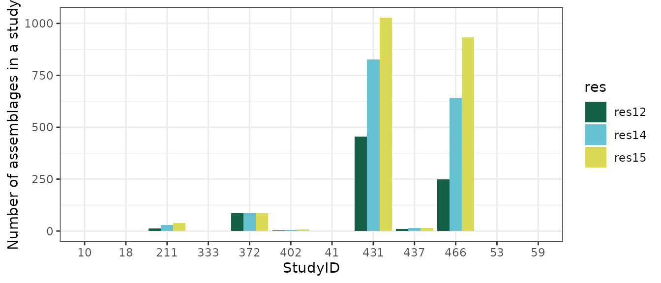 The number of cells in each study varies depending on the resolution
chosen.
You can also map what happens when gridding the data:
## The following example is built on the demonstrations in
## https://cran.r-project.org/web/packages/dggridR/vignettes/dggridR.html.
# First we build the ~96 km2 global grid
dgg_12 <- dggridR::dgconstruct(res = 12)
# To simplify, we only map the grid cell boundaries for cells which
# have observations.
# NOTE: if you are working with the full BioTIME database, this step may take some time.
grid_12 <- dggridR::dgcellstogrid(dgg_12, grid_samples$cell)
# Now let's follow the same steps and build a ~10.7 km2 global grid:
dgg_14 <- dggridR::dgconstruct(res = 14)
grid_14 <- dggridR::dgcellstogrid(dgg_14, grid_samples_14$cell)
# And we get some polygons for each country of the world, to create a background:
countries <- ggplot2::map_data("world")
# Now you could map the whole world, but let's just zoom in the UK and have a look at
# STUDY 466 (Marine Fish):
map_uk_locations <- ggplot() +
geom_polygon(data = countries, aes(x = long, y = lat, group = group), fill = NA, color = "grey") +
geom_sf(data = grid_12, aes(), color = alpha("blue", 0.4)) +
coord_sf(xlim = c(-20, 10), ylim = c(50, 60)) +
geom_rect(aes(xmin = -11, xmax = -0.7, ymin = 57.2, ymax = 59), colour = "red", fill = NA) +
labs(x = NULL, y = NULL) +
theme_bw() + theme(text = element_text(size = 8))
zoom_in_map <- ggplot() +
geom_polygon(data = countries, aes(x = long, y = lat, group = group), fill = NA,
color = "grey") +
geom_sf(data = grid_12, aes(), color = alpha("blue", 0.4)) +
geom_sf(data = grid_14, aes(), color = alpha("red", 0.4)) +
coord_sf(xlim = c(-11, -0.7), ylim = c(57.2, 59)) +
theme_bw()
grid::grid.newpage()
main <- grid::viewport(width = 1, height = 1, x = 0.5, y = 0.5) # the main map
inset <- grid::viewport(width = 0.4, height = 0.4, x = 0.82, y = 0.45) # the inset in bottom left
# The resulting distribution of different size cells appears as follows:
print(zoom_in_map, vp = main)
print(map_uk_locations, vp = inset)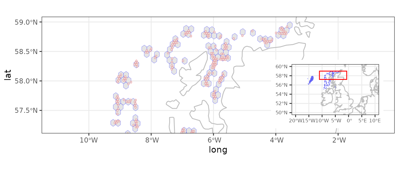 We can see that the higher the resolution set the higher the number of
cells into which samples get assigned. There is thus the risk of the
resulting assemblages time series becoming too small to have any
ecological meaning. A good rule of thumb is to never set
res higher than the resolution you get when
resByData = TRUE.
Why rarefaction is a must!
Now we will deal with another common issue when working with time series data: the fact that the number of samples may vary over time. When evaluating changes through time it’s important to be able to quantify change independently of the number of samples, i.e. we want to be able to assess whether e.g. alpha diversity has truly increased or decreased over time and that such signal is not a sampling artifact due to uneven sampling effort – i.e. resulting from having more or fewer samples in different years or periods of the time series being compared.
Probably the most common and widely used approach to prevent temporal
variation in sampling effort from affecting diversity estimate is to
apply sample-based rarefaction. Here (add link) is a great introduction
to it. BioTIMEr provides the resampling() function that
implements sample-based rarefaction, already adapted to BioTIME data and
designed to run smoothly over the previously gridded dataset as done
above. The function identifies the minimum number of samples across all
years in a time series and then uses this minimum to randomly resample
each year down to that number.
Let’s continue with our BioTIME example subset dataset:
# First, if you are not sure you need this step,
# you can always check how many samples there are in every year of the different time series:
check_samples <- grid_samples |>
  group_by(STUDY_ID, assemblageID, YEAR) |>
  summarise(n_samples = n_distinct(SAMPLE_DESC), n_species = n_distinct(Species))

check_samples |> head(10) |> kable()| STUDY_ID | assemblageID | YEAR | n_samples | n_species |
|---|---|---|---|---|
| 10 | 10_359170 | 1984 | 164 | 22 |
| 10 | 10_359170 | 1992 | 163 | 20 |
| 10 | 10_359170 | 1996 | 107 | 20 |
| 18 | 18_335699 | 1923 | 4 | 26 |
| 18 | 18_335699 | 1926 | 4 | 27 |
| 18 | 18_335699 | 1927 | 3 | 21 |
| 18 | 18_335699 | 1929 | 4 | 27 |
| 18 | 18_335699 | 1930 | 16 | 34 |
| 18 | 18_335699 | 1931 | 16 | 30 |
| 18 | 18_335699 | 1932 | 26 | 45 |
Looking at the n_samples column we can already see for
the few assemblages in this subset that there are substantial
differences in sampling effort (i.e. number of samples) through time.
Thus, we should standardize for sampling effort:
# Let's apply resampling() then, using the data frame of the gridded data:
grid_rare <- resampling(x = grid_samples, measure = "ABUNDANCE",
                       resamps = 1, conservative = FALSE)
The function returns a single long-form data frame containing the
total currency of interest (i.e. summed across all samples) for each
species in each year within each assemblage time series. You can specify
what the currency field is: Abundance, Biomass or both (BioTIME studies
can include records for either or both). Note that resampling() also
tests and removes any NAs within the selected currency
field(s) before implementing the sample-based rarefaction. Thus, if you
choose to use both currency fields, only observations (when
conservative = FALSE) or full sampling events (when
conservative = TRUE) in which BOTH Abundance and Biomass
were recorded are retained and a warning is issued as follows:
# Keep only observations with both abundance and biomass
grid_rare_ab <- resampling(x = grid_samples, measure = c("ABUNDANCE", "BIOMASS"),
    resamps = 1, conservative = FALSE)
## Warning in resampling(x = grid_samples, measure = c("ABUNDANCE", "BIOMASS"), : NA values found and removed.
## Only a subset of `x` is used.
# Keep only sampling events where all observations within had both abundance
# and biomass to start with
grid_rare_abT <- resampling(x = grid_samples, measure = c("ABUNDANCE", "BIOMASS"),
    resamps = 1, conservative = TRUE)
## Warning in resampling(x = grid_samples, measure = c("ABUNDANCE", "BIOMASS"), : NA values found and whole samples removed since `conservative` is TRUE.
## Only a subset of `x` is used.How many resampling iterations should we implement?
Remember that sample-based rarefaction involves randomly selecting a specified number of samples (i.e. sampling events) for each year, this number being equal to the number of samples in the year with the lowest sampling effort in each time series. If the sampling effort through time was equal or relatively stable, then you probably do not need to concern yourself any further. However, for many time series in BioTIME (or indeed other biodiversity data) sampling effort can vary substantially, and thus the sample-based rarefaction process can lead to different species diversity and composition simply by randomly selecting different samples. To help exemplify this point across, let’s pick one assemblage time series from the subset and plot the number of samples recorded in each year:
# What is the number of samples in the year with the lowest sampling effort?
ggplot(data = check_samples[check_samples$assemblageID == "18_335699",], aes(x = YEAR, y = n_samples)) +
  geom_col(aes(x = YEAR, y = n_samples), fill = "red", alpha = 0.5) +
  geom_segment(aes(x = 1926, y = min(n_samples) + 3,
                   xend = 1927, yend = min(n_samples)),
               arrow = arrow(length = unit(0.2, "cm"))) +
  xlab("Year") + ylab("Number of samples") +
  theme_bw()
## Warning in geom_segment(aes(x = 1926, y = min(n_samples) + 3, xend = 1927, : All aesthetics have length 1, but the data has 29 rows.
## ℹ Please consider using `annotate()` or provide this layer with data containing
## a single row.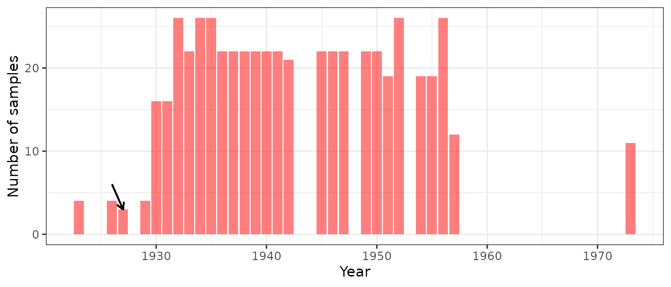
# In this case,the year 1927 had the lowest sampling effort, with 3 samples (arrow).In this particular case, what resampling()will do is to
randomly select and retain only 3 samples from each year of this time
series. As you can see in the plot, several years have 20 samples or
more; so if you run the function a second time it’s likely that the
sample-based rarefaction process will select a different combination of
3 samples (with the exception of year 1927), which may or may not differ
in their species diversity and composition.
One option to deal with this issue is to repeat this random sampling process multiple times, effectively creating multiple alternative datasets for the same time series (and which can be used in subsequent sensitivity analysis or to estimate the variability in diversity metrics that originates from the random sample selection process):
# Let's implement the sample-based rarefaction by resampling the dataset 10 times.
grid_rare_n10 <- resampling(x = grid_samples, measure = "ABUNDANCE", resamps = 10,
                            conservative = FALSE)

# Note that you may want to resample many more times (e.g. at least 30-100+ times, but up to 199
# if e.g. working with the whole BioTIME data), depending on how many iterations you want a
# subsequent bootstrap analysis to have.
# This may also take some computation time, so if you are working with a big subset of BioTIME
# is advisable to break it down in smaller subsets.

# Each resampling iteration will be identified as resamp = 1:n, in this case 1:10.
# Now we can check if there are differences across the first 3 of these iterations:

check_resamps <- grid_rare_n10[grid_rare_n10$resamp < 4,] |>
  group_by(STUDY_ID, assemblageID, resamp) |>
  summarise(n_obs = n(), n_species = n_distinct(Species), n_year = n_distinct(YEAR))

check_resamps |> head(10) |> kable()| STUDY_ID | assemblageID | resamp | n_obs | n_species | n_year |
|---|---|---|---|---|---|
| 10 | 10_359170 | 1 | 59 | 24 | 3 |
| 10 | 10_359170 | 2 | 60 | 24 | 3 |
| 10 | 10_359170 | 3 | 61 | 25 | 3 |
| 18 | 18_335699 | 1 | 738 | 75 | 29 |
| 18 | 18_335699 | 2 | 740 | 76 | 29 |
| 18 | 18_335699 | 3 | 718 | 72 | 29 |
| 41 | 41_453357 | 1 | 418 | 56 | 10 |
| 41 | 41_453357 | 2 | 418 | 56 | 10 |
| 41 | 41_453357 | 3 | 418 | 56 | 10 |
| 53 | 53_394335 | 1 | 44 | 5 | 10 |
Since sampling events within a study are retrieved with a consistent
methodology and observational effort, we don’t expect to see big
differences between picking some sampling events over others, however
it’s still an advisable check to do. The example above also highlights
the fact that during the process of standardising the number of samples
per year within each time series, a lot of data will be discarded.
Additional steps, such as removing low sampling years, before applying
the resampling() function may minimize this effect.
Your data is now ready for analysis! You can stop here and go do your own thing (the world is your oyster!)…or you can follow the next steps and learn how to use the BioTIMEr package to estimate a few standard diversity metrics, as well as some hints on how to quantify and visualize temporal biodiversity change for a given BioTIME data subset.
Please note that as BioTIMEr is designed to interact with BioTIME data, the functions are built using BioTIME variable names. However the functions and workflow we describe can be easily applied to any time series data as long as the variable names are modified accordingly before.
Calculate diversity estimates
Now the following functions are pretty straightforward.
getAlphaMetrics() and getBetaMetrics()
estimate a set of common alpha and beta diversity metrics for each year
within each time series in your BioTIME data. Let’s apply them to our
now processed BioTIME example dataset:
# Get alpha metrics estimates:
alpha_metrics <- getAlphaMetrics(x = grid_rare, measure = "ABUNDANCE")
# see also help("getAlphaMetrics") for more details on the metrics

# Have a quick look at the output
alpha_metrics |> head(6) |> kable()| assemblageID | YEAR | S | N | maxN | Shannon | Simpson | invSimpson | PIE | DomMc | expShannon |
|---|---|---|---|---|---|---|---|---|---|---|
| 10_359170 | 1984 | 19 | 3427 | 1863 | 1.557755 | 0.6598196 | 2.939616 | 0.6600122 | 0.6798950 | 4.748150 |
| 10_359170 | 1992 | 20 | 2029 | 920 | 1.760637 | 0.7347483 | 3.770004 | 0.7351106 | 0.6106456 | 5.816141 |
| 10_359170 | 1996 | 20 | 2220 | 1153 | 1.659082 | 0.6868517 | 3.193375 | 0.6871612 | 0.6698198 | 5.254485 |
| 18_335699 | 1932 | 28 | 376 | 110 | 2.246459 | 0.8274955 | 5.796949 | 0.8297021 | 0.5425532 | 9.454203 |
| 18_335699 | 1937 | 27 | 616 | 144 | 2.369010 | 0.8611539 | 7.202217 | 0.8625541 | 0.4399351 | 10.686803 |
| 18_335699 | 1942 | 32 | 1613 | 274 | 2.537124 | 0.8922122 | 9.277486 | 0.8927657 | 0.3279603 | 12.643251 |
# Get beta metrics estimates:
beta_metrics <- getBetaMetrics(x = grid_rare, measure = "ABUNDANCE")
#see also help("getBetaMetrics") for more details on the metrics

# Have a quick look at the output
beta_metrics |> head(6) |> kable()| YEAR | assemblageID | JaccardDiss | MorisitaHornDiss | BrayCurtisDiss |
|---|---|---|---|---|
| 1984 | 10_359170 | 0.0500000 | 0.0175351 | 0.2727273 |
| 1992 | 10_359170 | 0.3043478 | 0.0078712 | 0.2672215 |
| 1996 | 10_359170 | 0.2608696 | 0.0209460 | 0.1452106 |
| 1932 | 18_335699 | 0.5526316 | 0.1687027 | 0.4193548 |
| 1937 | 18_335699 | 0.5000000 | 0.5046294 | 0.7506285 |
| 1942 | 18_335699 | 0.4878049 | 0.6203689 | 0.6270598 |
# NOTE the functions used the rarefied data with only one resampling iterationThere are many metrics for measuring biodiversity in community
ecology. Here, we focused on the more commonly used metrics when
measuring temporal changes in biodiversity. getAlphaMetrics() estimates
nine alpha diversity metrics: Species richness (S),
numerical abundance (N), maximum numerical abundance
(maxN), Shannon index, Simpson index, inverse Simpson,
McNaughton dominance, probability of intraspecific encounter
(PIE) and exponential Shannon. getBetaMetrics() estimates
three beta diversity metrics: Jaccard dissimilarity, Bray-Curtis
dissimilarity and Morisita-Horn dissimilarity, assuming the first year
in the time series as the baseline. Note that N and
maxN metrics return numerical abundance when
measure=ABUNDANCE, and biomass values when
measure=BIOMASS.
Investigating biodiversity trends
Finally, when looking to measure biodiversity change using temporal
data, it is common to estimate temporal trends in alpha diversity and
beta diversity by fitting a simple linear regression to the diversity
estimates over the duration of the time series. The
getLinearRegressions() function implements linear models as
a function of year and is designed to run smoothly over an output of
either the getAlphaMetrics() or
getBetaMetrics() functions. Specifically, it provides the
results of simple linear regressions (slope, p-value, significance,
intercept) using lm(), and fit individually to the yearly diversity
estimates of each metric within each assemblage time series in your
dataset.
# Let's apply it then:
alpha_slopes <- getLinearRegressions(x = alpha_metrics, divType = "alpha",
                                     pThreshold = 0.05) #for alpha metrics


# Have a quick look at the output
alpha_slopes |> head(6) |> kable()

beta_slopes <- getLinearRegressions(x = beta_metrics, divType = "beta",
                                    pThreshold = 0.05)  #for beta metrics

# Have a quick look at the output
# beta_slopes |> head(6) |> kable()| assemblageID | metric | slope | pvalue | significance | intercept |
|---|---|---|---|---|---|
| 10_359170 | S | 0.0892857 | 0.2122956 | 0 | -158.071429 |
| 10_359170 | N | -111.1785714 | 0.2927126 | 0 | 223878.142857 |
| 10_359170 | maxN | -67.5535714 | 0.3647395 | 0 | 135788.642857 |
| 10_359170 | Shannon | 0.0108605 | 0.5460426 | 0 | -19.960516 |
| 10_359170 | expShannon | 0.0552380 | 0.5646626 | 0 | -104.687532 |
| 10_359170 | Simpson | 0.0032689 | 0.6471082 | 0 | -5.813447 |
You can change the default P-value threshold for statistical
significance (i.e. the measure of the strength of evidence against
H0). For easy sorting, plotting and interpretation, a
column called significance is also provided, where 1
indicates the threshold is met, i.e. the estimated slope is significant
at the specified p-value level.
Also note that some biodiversity analysis may benefit from additional transformations and scaling of data before modelling (check a nice tutorial on the subject here).
Summarize and visualize biodiversity trends
Now that we have quantified change through time, we are ready to make some plots! The next section provides only a few examples of queries and data visualization, but it’s not a comprehensive exploration of the results, which will also vary depending on your own research question.
Right, let’s start will some overall summaries and trends:
# First, how many assemblages in our dataset show a moderate evidence (P < 0.05) of change in alpha diversity?
check_alpha_trend <- alpha_slopes |>
  group_by(metric) |>
  filter(significance == 1) |>   # or use filter(pvalue<0.05)
  summarise(n_sig = n_distinct(assemblageID), mean(slope))

check_alpha_trend |> kable()| metric | n_sig | mean(slope) |
|---|---|---|
| S | 32 | -0.2871529 |
| N | 38 | -205.9537852 |
| maxN | 34 | -122.0155009 |
| Shannon | 41 | 0.0029688 |
| expShannon | 38 | -0.0733975 |
| Simpson | 36 | 0.0113787 |
| invSimpson | 32 | -0.0055302 |
| PIE | 35 | 0.0105492 |
| DomMc | 23 | -0.0072704 |
# We can see that only a few (<40) of the assemblage time series actually show a significant
# trend of change over time, independently of the metric used. This indicates that in most
# time series in the studies we analysed alpha diversity is not really changing through time.
Let’s do some summary plots showing the variation of alpha diversity change:
# Get a slope per assemblageID and metric
alpha_slopes_simp <- alpha_slopes |>
  group_by(assemblageID, metric, pvalue) |>
  filter(significance == 1) |>   #select only the assemblages with significant trends
  summarise(slope = unique(slope))

# Calculate the mean slope and CIs
stats_alpha <- alpha_slopes_simp |>
  group_by(metric) |>
  summarise(mean_slope = mean(slope), #mean
            ci_slope = qt(0.95, df = length(slope) - 1) * (sd(slope, na.rm = TRUE) / sqrt(length(slope)))) #margin of error

# Let's put it all together
ggplot(data = alpha_slopes_simp) +
  geom_histogram(aes(x = slope, fill = metric), bins = 25) +
  #geom_density(alpha=0.5)+ #in case you what a density plot instead
  geom_vline(aes(xintercept = 0), linetype = 3, colour = "grey",linewidth = 0.5) + #add slope=0 line
  geom_vline(data = stats_alpha, aes(xintercept = mean_slope), linetype = 1,
             linewidth = 0.5,colour = "black") + #mean
  geom_vline(data = stats_alpha, aes(xintercept = mean_slope - ci_slope),
             linetype = 2, linewidth = 0.5, colour = "black") + #lower confidence interval
  geom_vline(data = stats_alpha, aes(xintercept = mean_slope + ci_slope),
             linetype = 2, linewidth = 0.5, colour = "black") + #upper confidence interval
  facet_wrap(~metric, scales = "free") +
  scale_fill_biotime() +  #using the customize BioTIME colour scale. See help("scale_color_biotime") for more options.
  ggtitle("Alpha diversity change") +
  theme_bw() +
  theme(legend.position = "none",plot.title = element_text(size = 11, hjust = 0.5))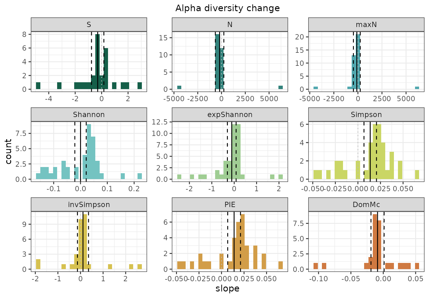
Now the same for beta diversity change:

# Hint: If you wish to plot all metrics together, simply merge you alpha_slopes and
# beta_slopes dataframes beforehand.
That’s great! While overall trends are important, you may also want to evaluate the patterns for a specific taxa or climate, and look at both sets of trends (i.e. significant and non-significant) together. For example, let’s say you want to have a look at changes in Shannon diversity for the two more represented taxon in our example BioTIME dataset.
# First, we need to check the meta file and retrieve the information for the studies of interest
#head(BTsubset_meta)
meta <- select(BTsubset_meta, STUDY_ID, TAXA, REALM, CLIMATE)

# Get a slope per assemblageID and metric
alpha_slopes_simp <- alpha_slopes |>
  group_by(assemblageID, metric, 'pvalue', significance) |>
  summarise(slope = unique(slope))

# Get back the Study ID by separating our assemblageID column into multiple other columns.
alpha_slopes_simp <- alpha_slopes_simp |>
  separate_wider_delim(
    cols = assemblageID,
    names = c("STUDY_ID", "cell"),
    delim = "_",
    cols_remove = FALSE
  ) |>
  as.data.frame()

# Merge it all
alpha_slopes_meta <- merge(alpha_slopes_simp, meta, by = "STUDY_ID")

# Select relevant data for plotting
alpha_slopes_set1 <- subset(
  alpha_slopes_meta,
  alpha_slopes_meta$metric == "Shannon" &
    (alpha_slopes_meta$TAXA == "Fish" | alpha_slopes_meta$TAXA == "Birds")
)

# Let's put it all together
ggplot(data = alpha_slopes_set1, aes(x = slope, fill = TAXA)) +
  geom_histogram(fill = "grey", bins = 25) + #all assemblages
  geom_histogram(
    data = alpha_slopes_set1[alpha_slopes_set1$significance == 1, ],
    bins = 25
  ) + #only significant change assemblages
  geom_vline(
    aes(xintercept = 0),
    linetype = 3,
    colour = "black",
    linewidth = 0.5
  ) + #add slope=0 line
  facet_wrap(~TAXA, scales = "free") +
  scale_fill_biotime() +
  ggtitle("Shannon-Weiner Species Diversity Index") +
  theme_bw() +
  theme(plot.title = element_text(size = 11, hjust = 0.5))
# Now we see the full distribution of slopes of change for the Shannon index for the birds
# and fish time series in our subset: all slopes are shown in grey, while in color we show
# the subset of assemblages for which evidence (P < 0.05) of change was detected.
We might also want to explore the different trends for a given time series, allowing us to visualise the data and the trend line:
# Let's go back to the data frame with the yearly values and select our relevant data for plotting
alpha_metrics_set <- subset(alpha_metrics, assemblageID == "18_335699")

# Transform data
alpha_metrics_set_long <- pivot_longer(alpha_metrics_set,
                                   cols = c("S", "N", "maxN", "Shannon", "expShannon",
                                   "Simpson", "invSimpson", "PIE", "DomMc"),
                                   names_to = "metric",
                                   names_transform = as.factor)

# Get assemblage ID slope of change
alpha_slopes_set2 <- subset(alpha_slopes, assemblageID == "18_335699")

# Get assemblage ID
name_assemblage <- unique(alpha_slopes_set2$assemblageID)

# Merge info
alpha_metr_slop<- left_join(alpha_slopes_set2, alpha_metrics_set_long,
                                join_by(assemblageID, metric))

# Let's put it all together
ggplot(data = alpha_metr_slop, aes(x = YEAR, y = value)) +
    geom_point(colour = "#155f49", size = 1) +   #plot the yearly estimates
    stat_smooth(method = "lm", se = FALSE, linetype = 2, colour = "grey") + #draw all regression line
    stat_smooth(data = subset(alpha_metr_slop, alpha_metr_slop$significance == 1),
                aes(x = YEAR, y = value), method = "lm", se = FALSE,
                linetype = 2, colour = "#155f49") + #color only trends that are significant
    facet_wrap(~metric, scales = "free") +
    scale_fill_biotime() +
    ggtitle(paste("Assemblage", name_assemblage)) + ylab("Diversity") +
    theme_bw() + theme(plot.title = element_text(size = 11, hjust = 0.5))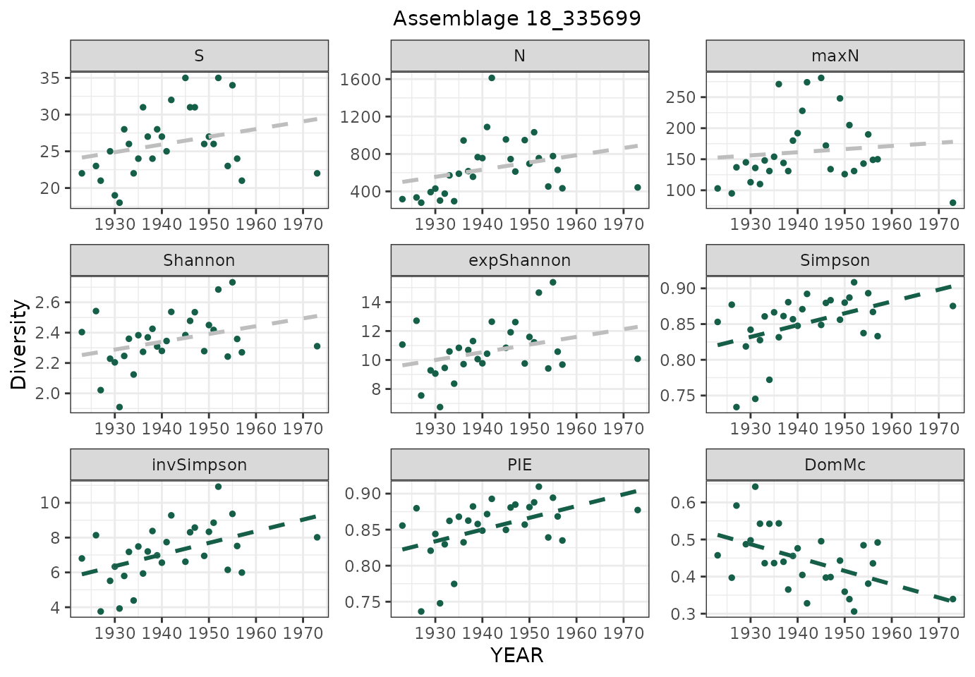
We can see that results vary depending on the dataset and the metric of change used. It is important to remember that biodiversity metrics are just a tool used to measure changes, and each have diverse abilities to detect changes in different biodiversity dimensions and under different scenarios e.g.They thus provide different pieces of a complex puzzle and may strongly affect our interpretation of biodiversity change.
Credits and Disclaimer
This R package was developed by the BioTIME team. The functions and documentation were developed predominantly by Alban Sagouis, Faye Moyes and Inês S. Martins. For optimal use, the package should operate in the manner described here. Feedback is appreciated, particularly if you come across any errors or would like to suggest changes. Updates will be made sporadically.